
Branding Projects
Inkline Stationery & Living
Inkline is a fun, young brand offering fun printed stationery and living products at affordable prices. They approached us to design their brand identity and the brief was to keep it simplistic, fun, and colorful. We also designed their social media strategy.

Describe your image


Describe your image
Shukrana Organics
This consumer goods company reached out to us to create a logo for them. Their product lines consisted of organic medicines and healthy food products. We gave them earthy colours signifying the natural aspect of their product line along with divided leaves signifying the various product lines the company has to offer.


Sugar & Other Stories
Sugar & Other Stories is a home baker who reached out to us to help create their brand identity. They were looking for a fun, cute and abstract identity so we went with abstract shapes with subtle pastel colours.


New to Chennai
New to Chennai is a one-stop-blog that brings you the latest on everything in the city. We created a fun and casual logo for their blog defining their brand personality by using a handwritten typeface, fun colours, and a doodle structure.


Weddings by Sway
Weddings By Sway is leader for wedding entertainment in the city of Chennai. They deliver complete entertainment solutions for your special day! We provided them with a complete social media strategy across all their thriving channels.

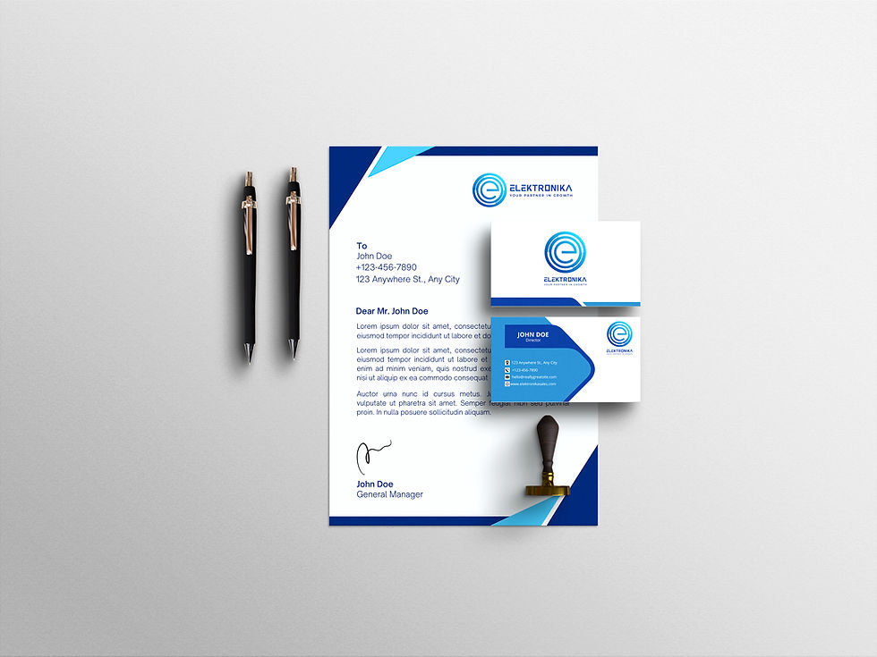
Elektronika Sales
Elektronika, a distributor of electronic components, has been the most trusted partner of the Indian electronic industry. It stands as one of the leading and largest electronics components distributors in India.

Indy Wok
Indy Wok is a chinese restaurant offering the best Indo-Chinese food.

Raphia
Raphia is here to redefine affordable fashion with handmade, high-quality craftsmanship and Modern Style. We gave them a modern look with bold colors to complement their ideology.


MWM Productions
The MWM Productions logo combines elegance and fun, with a classic font that exudes sophistication and vibrant brand colors that add a lively touch. A hint of sparkle represents the magic and grandeur of luxury weddings. This beautifully balanced design reflects MWM Productions’ expertise in creating unforgettable wedding choreography and upscale event experiences.


Dr.Omars Eye Care
This eye care hospital desired a twist to its traditional branding. Our sleek graphics transformed all their platforms and perfectly portrayed their brand personality. The bold typeface gave them a fresh, modern look.


Go Brgr
This new burger joint in the city offers a wide range of gourmet burgers. We created their logo keeping it simple and abstract with a bright color making it eye-catching.


Chennai Grocers
A gourmet grocery service that became the talk of the town. We were asked to create a fun yet minimal logo for the brand. So we kept it simple and gave it a bright yellow to add the perfect touch of fun. We created holistic branding solutions and provided them with a catchy logo, digital menus, and packaging stickers.


The Tailored Wardrobe
This bespoke fashion boutique based in Chandigarh came to us to design their branding, social media and website. We gave them a minimal yet modern design with a beautiful celeste colour.


Manhar
The home of intricate crocheted clothing and home decor, Manhar is a one-stop shop for all things crochet. All products at Manhar are handmade with love. We provided them with a warm and cozy branding with vibrant colours.


Events by Nikkita Ram
An upcoming event management company got in touch with us to give their brand a completely new look. A beautiful floral-themed design combined with a modern typeface brought sleekness and complimented the contemporary brand personality perfectly.


The Wedding People
The Wedding People are wedding planners who create beautiful weddings. A beautiful floral-themed design combined with a handwritten font brought a fun and happy touch to the contemporary brand personality.


NAPA - a napping panda
The NAPA logo perfectly captures the essence of the brand with its creative design. The letters "P" and "A" are cleverly crafted to form the face of a napping panda, symbolizing both comfort and relaxation. This playful yet sophisticated logo reflects NAPA's commitment to luxurious comfort and trendy style, making it an iconic representation of the brand’s premium clothing collection.


Pure & Rare
The "Pure N Rare" monogram perfectly embodies the brand’s essence, featuring a half-moon with a radiant sparkle that reflects the brilliance of gemstones. Intertwined circles represent the brand’s connection to Vedic astrology, while the nine sun rays symbolize the Navratnas, the sacred gemstones of Vedic tradition. This celestial design reflects Pure N Rare's mission to deliver gems with cosmic power and purity. We developed the complete brand guidelines, ensuring every element aligns with the brand’s vision and values.

